| View previous topic :: View next topic |
| Author |
Message |
Burakov_Anatoly
Jam Meister

Joined: 01 Sep 2009
Posts: 56
|
 Posted: Tue Sep 01, 2009 10:52 am Post subject: Posted: Tue Sep 01, 2009 10:52 am Post subject: |
 |
|
| thanks, will be waiting! keep up the good work! |
|
| Back to top |
|
 |
Ralph [RZ]
Site Admin

Joined: 02 Jan 2008
Posts: 13332
|
| Posted: Fri Sep 11, 2009 11:30 am Post subject: |
|
|
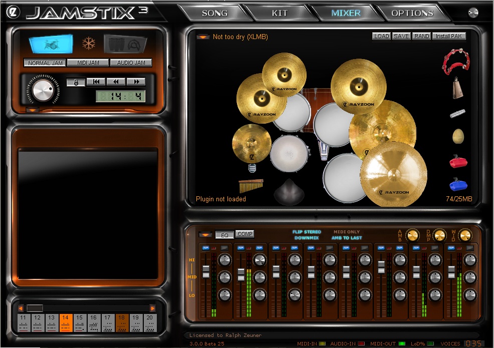
As you know, we have had a setback with Scott Kane not being able to finish the GUI. However, we are now back on track and here are a few screenshots of our work in progress. Note that some controls are missing or not finished and that the song sheet is off.
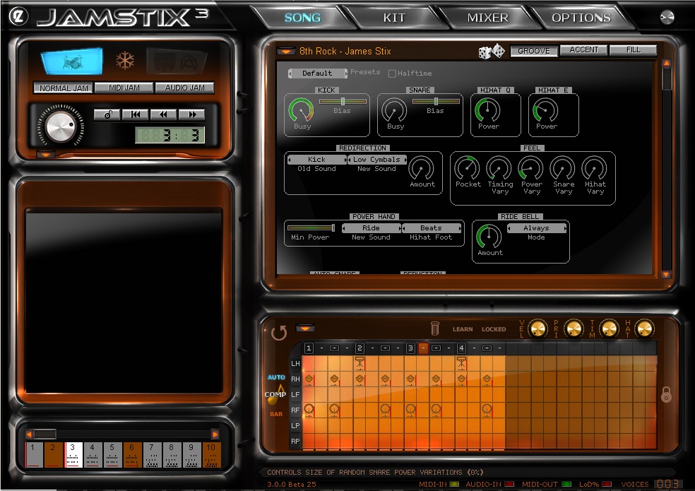
Here are the new virtual kit and mixer. The kit now reorganizes itself automatically based on what drums and cymbals loaded and what their sizes are.
_________________
Ralph Zeuner
Rayzoon Technologies LLC
http://www.rayzoon.com |
|
| Back to top |
|
|
sammy24
Jamologist

Joined: 31 Mar 2005
Posts: 138
|
| Posted: Fri Sep 11, 2009 1:12 pm Post subject: |
|
|
Looking real nice. 
Is there currently a way to copy just the notes of a single limb from one bar to the next? (I had a project, where I added a hand-edited shaker part to the first bar of an existing part, and was trying to figure out how to add that shaker part to the remaining bars in the part without copying the whole bar-- whatever else was there I wanted to leave the way it was.)
Also, any chance of implementing 1) ability to solo/mute specific limbs
2) recompose specific limbs and/or drums (like just recompose the hi hat part, with a different variation that's based on the style/settings)
Thanks! |
|
| Back to top |
|
|
Susan G
Grand Master Jam

Joined: 10 May 2007
Posts: 309
|
| Posted: Fri Sep 11, 2009 1:21 pm Post subject: |
|
|
That's looking very nice, Ralph!
-Susan |
|
| Back to top |
|
|
Reaper_GG
Jammer

Joined: 26 Dec 2008
Posts: 23
|
| Posted: Fri Sep 11, 2009 2:17 pm Post subject: |
|
|
this looks fantastic
Im looking forward to upgrading! |
|
| Back to top |
|
|
ludmillus
Jammer
Joined: 14 Apr 2008
Posts: 22
|
| Posted: Fri Sep 11, 2009 5:03 pm Post subject: |
|
|
 Hi Ralph, Hi Ralph,
I like the new outfit of Jamstix3!
Regards
Carl |
|
| Back to top |
|
|
rcraig42
Jam Meister
Joined: 23 Aug 2007
Posts: 97
|
| Posted: Fri Sep 11, 2009 5:46 pm Post subject: |
|
|
I'm guessing the non lit area adjacent to the blue lit trap set is the Jamcussion button?
ETA: ooops just saw the higher contrast in that button on the second screenshot and confirmed my guess |
|
| Back to top |
|
|
A/V4U
Jam Meister
Joined: 14 May 2007
Posts: 92
|
| Posted: Sat Sep 12, 2009 1:35 am Post subject: |
|
|
| Seeing pictures just confirmed your great work...just can't wait JS3 |
|
| Back to top |
|
|
hitch_
Junior Jammer

Joined: 03 Jan 2009
Posts: 18
|
| Posted: Sat Sep 12, 2009 8:49 am Post subject: |
|
|
Ralph, while I appreciate the hard work that has gone into the GUI, I feel that it is still very inefficient. Please look at how much space in the GUI is taken up by the massive borders to each section. There is absolutely no need for a computer program to use up so much space in simulating an equivalent hardware instrument. All you need is different coloured panels to differentiate sections. You're losing 3-4 cms of valuable screen space in both the vertical and horizontal axis. There are vertical scroll bars in the drummer control panel so it's obvious that you're having trouble fitting everything on the screen. Have a look at U-he's Zebra Synth:

Or Ableton Live: http://www.ableton.com/live-session-view
Now look at the enormous amount of blank space in Jamstix's drummer control section: there are acres of blank screen!  The drum grid is still far too small for easy use - many users have asked for a bigger screen for easier editing. The drum grid is still far too small for easy use - many users have asked for a bigger screen for easier editing.
Does the main transport section (top left) really need to be that big? Schematic controls would take up less than half that size.
Again, do users really need such a large picture of the drum kit? You'll notice that the mixer below it is rather cramped. Reduce the drum kit picture in size (better yet, make it a minimalistic schematic) and you'll have much more room for the mixer/EQ controls.
I urge you to move away from the "imitation hardware" look. You're a superbly efficient computer programmer - please apply that same efficiency to Jamstix's GUI. Ableton Live uses a stripped-down, almost diagrammatical GUI, yet it manages to fit in an awful lot of information on the screen. It wastes little space yet is still easy to understand.
Why not extend the look of the drumming controls (slim, efficient, easy to use and understand) to the entire GUI?
It's also well known that many people find coloured icons and text on a black background to be very tiring to use. Lighten the background and the program will immediately become easier on the eye. This forum is a good example. 
Please don't think this is a negative post. Jamstix is an amazing program and I'd love it to become even more successful, but I think the new GUI only does half the job: it looks better but it does not make Jamstix easier to use. It might be a good idea to re-read this thread and concentrate on Jamstix's function rather than form.
But I'm still a Jamstix fan. 
_________________
Read reviews of free netlabel and/or Creative Commons music at Catching The Waves, the net's most amateurish blog devoted to free music. |
|
| Back to top |
|
|
spitfire31
Jammer
Joined: 23 Feb 2008
Posts: 41
|
| Posted: Sat Sep 12, 2009 10:48 am Post subject: |
|
|
| hitch_ wrote: | | Ralph, while I appreciate the hard work that has gone into the GUI, I feel that it is still very inefficient. Please look at how much space in the GUI is taken up by the massive borders to each section. |
I have to agree with hitch_ here. While flashy and impressive in its own way, I think that the IF looks a bit like the dashboard of a 1972 Chevy van. Too much chrome and fake veneer, wasting screen estate. I wouldn't want to use the word 'vulgar', but it's pretty dam' close
Personally, I find all this eye candy distracting and I think it interferes with quick orientation. I'm all for the more fastidious and economic GUI style of Zebra and Live that hitch_ refers to. I find that kind of interface much easier on the eyes and hence much simpler to navigate.
Please note how the Zebra interface still has subtle 3D visual cues and shading, discreetly separating the different control groups from each other and breaking up what might otherwise appear monotonous.
At the very least, I hope that the Version 3 GUI will be skinnable. That way, perhaps we can have horses for all kinds of courses.
I'm a Jamstix fan too! Otherwise I wouldn't bother
Best,
Joachim |
|
| Back to top |
|
|
charly1310
Jammer
Joined: 06 Sep 2006
Posts: 23
|
| Posted: Sat Sep 12, 2009 6:56 pm Post subject: |
|
|
@hitch & spitfire: +1
I have to agree here. To me the new GUI looks terrible. It's certainly a little more modern than JS1 and JS2, but it doesn't do away with Jamstix initial design flaws. I still see too many different fonts, too many bold borders and too tiny controls. In general the GUI looks very cluttered with many different visual styles for objects all cramped together. There's no sophisticated design concept behind it, other than trying to look "cool".
Although you said that the GUI design is still work in progress I recommend to totally scrap that design and start from scratch. Not only from a visual point of view, but also for Jamstix' operability/usabilty concept. Right now I can't see any workflow enhancements represented by the GUI and I think that's where the whole issue starts.
Sorry for being so critical, but I really hope you reconsider the current design concept, because Jamstix deserves a much more professional GUI than that to keep up with it's outstanding core functions.
Cheers,
bM3w
_________________
Cubase 5.0.1 (32Bit) / Windows 7 RC1 64Bit / Intel C2D E6400 / GA P35-DS3R / 4GB RAM PC6400 / ATI Radeon HD2600XT 512MB
RME HDSP 9632 + AEB 4-I / 2x UAD-1 / Yamaha KX25 / CME UF-6 / Korg nanoPad / PODxt Live / Presonus TUBEPre / M-Audio DX4 |
|
| Back to top |
|
|
Ralph [RZ]
Site Admin
Joined: 02 Jan 2008
Posts: 13332
|
| Posted: Sat Sep 12, 2009 11:16 pm Post subject: |
|
|
Thank you all for your critical input. It is much appreciated even though I do not agree with all of the statements made. I am also quite certain that there are many people who would level criticism at the Zebra GUI shown above. Personally I do not find it attractive for a drum module, but having said that, it is a very functional GUI for a synthesizer.
Jamstix is a unique product in the components it must contain, which have higher complexity than the controls for normal drum modules or synthesizers. We are putting forth our best efforts to elevate the GUI in Jamstix 3 compared to Jamstix 2. We will continue to do so with Jamstix 4 and so forth. I am sure we will never please everyone but all criticism is very welcome.
You know, it is just so much easier to make a GUI for EZDrummer and the like, which need probably less than 10% of the controls that JS3 needs...
By the way, you can rearrange drums and cymbals in the virtual kit of JS3 and the limb calculations of the A.I. will consider the changes. So, if you move Crash 3 too far away from the throne then JS3 will immediately switch to Crash 2 and so forth. For me (maybe because I'm a drummer), that is just a cool thing that connects me emotionally to the product and feeds into my workflow atmosphere when working on a song. I am sure there will be many customers that will appreciate this feature. I also am sure that there will be many who find it superfluous or gimmicky. Another example is the bar editor. There are some users who never need it and would complain if we made it too large. Others use it a lot and can't have it large enough. There is no perfection attainable, just compromises.
Again, we can only do our best effort here and hope that it is appreciated in the community. And, again, we welcome the criticism so keep it coming
_________________
Ralph Zeuner
Rayzoon Technologies LLC
http://www.rayzoon.com |
|
| Back to top |
|
|
Mark Blair
Jam Meister
Joined: 21 Aug 2007
Posts: 87
Location: Florida, USA
|
| Posted: Sun Sep 13, 2009 2:24 am Post subject: |
|
|
I must be getting use to the "Jamstix" interface philosophy. I actually like the new interface. Not a lot -- but I like it!
In fact, maybe I do like it a lot.
Anyway, here's what I'm more concerned with: The ability to have e-drums drive JS3 (I just got a Yamaha DTXpress IV special edition, partially to learn how to think like a drummer -- and I really like it, except that it apparently doesn't transmit cymbal choke info to its midi out), AND have JS3 drive Superior Drummer 2 as effectively as possible (I think I'd prefer to standardize on using JS3's midi out rather than subhost Sd2).
And my main concerns about driving SD2 are: 1) making sure the CC4 hi-hat output of the e-drum controller drives Jamstix (and thereby also SD2) -- YET, have Jamstix by itself still be able to drive SD2 with "appropriate" CC4 hi-hat variations, and 2) using a correct SD2 midi key mapping -- not just within Jamstix, but within SD2, too. That's because SD2 has its default (initial) mapping, AND it has an e-drum mapping (which I'm using) PLUS I've had to use the SD2 "learn" function to "tweak" the SD2 mapping for a few of my DTXpress IV kit items.
In other words, I want to setup a standardized configuration with either my e-drums OR JS3 being able to drive SD2's numerous hi-hat articulations (and snare, too -- and also ride) as well as possible. And I want to be able to do this as efficiently as possible.
Am I dreaming??
BTW, Tommy Igoe's drum DVDs have helped me out a lot (as well as actually starting to use e-drums). Believe it or not, I didn't realize until about 3 weeks ago which limbs operated what!
Bottom line, I'm still looking for a streamlined strategy to kick out killer "realistic" drums -- and it looks like JS3 will do a lot of the "hard lifting", yet the e-drums will enable me to input "highly targeted" fills, etc,. as efficiently as possible.
Thoughts?? Suggestions?? |
|
| Back to top |
|
|
hitch_
Junior Jammer
Joined: 03 Jan 2009
Posts: 18
|
| Posted: Sun Sep 13, 2009 4:26 am Post subject: |
|
|
Hi Ralph,
Thank you for your comment. I admit that not everyone likes Zebra's (or Ableton's) interface, but I used them as examples of GUIs that distance themselves from the bloated "imitation hardware" paradigm and use screen real estate as efficiently as possible. I wasn't demanding that you produce a clone.
However, looking back through this thread, I notice a lot of comments and requests that haven't been addressed:
1. Consistent fonts
2. Larger beat grid
3. Different drum grid background colour to improve visibility
4. Smaller drum kit graphic
5. Workflow changes To that list, I'd add a collapsible song parts list that disappears when not in use, thus giving far more space to the drum controls and grid editor.
Now, I understand that making a new GUI involves a lot of hard work and ingenuity, and I also understand that it can be tiresome when Jamstix users want the moon on a stick - but the whole point of this thread was that you could read what Jamstix users want from Jamstix 3. It seems that the majority would like to see fundamental changes rather than just cosmetic ones.
I've read quite a few comments in various music production forums in which people have been discouraged/defeated by the appearance and function of both Jamstix 1 and 2; no doubt, you will have read many of these comments.
Please re-examine at least some of the items listed above. Even if it meant delaying the release of Jamstix 3, a revamp would be worth it if it attracted customers who had previously been confounded by Jamstix's appearance and workflow.
I remain a fan and remain grateful to you for your patience in dealing with pesky posters!
_________________
Read reviews of free netlabel and/or Creative Commons music at Catching The Waves, the net's most amateurish blog devoted to free music. |
|
| Back to top |
|
|
ukm
Jam Meister
Joined: 27 Mar 2005
Posts: 53
Location: Germany
|
| Posted: Sun Sep 13, 2009 4:51 am Post subject: |
|
|
The interface looks nice but my first impression is that there isn't much progress in handling compared to version 2.5.
To me one of the most important things is to know what is going on inside the bars and there is still a small area in the lower left section of the GUI. That still means much scrolling and clicking.
ukm |
|
| Back to top |
|
|
|
|
You cannot post new topics in this forum
You cannot reply to topics in this forum
You cannot edit your posts in this forum
You cannot delete your posts in this forum
You cannot vote in polls in this forum
|
Powered by phpBB © 2001, 2002 phpBB Group
|

